Soccer Club Kits, Vol. 1
Started by David Phillips · · 👁 67 views · 3.6K replies
Participants


 …
…


#2922 ·
Douglas Kern said:
Gothenburg official
These guys are even worse than Everton's
I mean, the colors technically go together, but actually choosing this shade for a kit? It's just ridiculous. Last year we had Newcastle rocking those bright yellow kits 🤣, and now Gothenburg is out here with pink 🙄, I'd bet anything the designer was just some hardcore colorblind guy...☕[/IMG][/I]

#2923 ·
neonheron202 said:Nope, this is just the Nike template they're planning to roll out for next year.
Good grief. Honestly, these are hands down the ugliest Barcin jerseys I've seen in my entire life. Seriously, since I started following soccer, I haven't seen anything quite like this. As far as design goes, it looks like some cheap knockoff you'd find at a flea market. Just... yikes. It's honestly pretty disastrous.
🤮
#2924 ·
Douglas Kern said:
Gothenburg official
These guys are even worse than Everton's
🙏🙏🙏🙏🙏
I bet all the fans are just dying to parade this through the streets.🙏

#2925 ·
Douglas Kern said:
Gothenburg official
These guys are even worse than Everton's
I dig the design, but the color is off for this kit. I’d love to see HSV and CFC adopt this pattern next season. For Chelsea, make them blue—just not this specific shade of blue. Use the one Everton uses instead; it looks classier. Also, swap out the black for white. As for Hamburg, let's go half-blue and half-black to match their crest. This white and red combo just isn't working for me.

#2926 ·
It appears this might be the new Adidas template they’re rolling out for next year—I actually caught a glimpse of a few similar designs recently, including one for Nuremberg—and I must say, I find it quite appealing.
It is specifically because of that subtle detail around the collar 🤣
It is specifically because of that subtle detail around the collar 🤣

#2927 ·
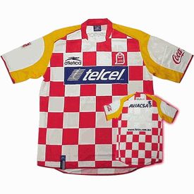
Is it actually possible they ripped off an American jersey design, or did we just steal theirs?
We're talking about the club Estudiantes from Mexico.

#2928 ·
Matthew Brown60 said:
Is it actually possible they ripped off an American jersey design, or did we just steal theirs?
We're talking about the club Estudiantes from Mexico.
It’s not plagiarism, man. We don't even own the rights to that specific look, and honestly, that club has cycled through similar kits a few times now. I can't say if they've rocked this style since forever, but I've definitely seen them wearing something like this before.
#2929 ·
mellowowl38 said:It’s not plagiarism, man. We don't even own the rights to that specific look, and honestly, that club has cycled through similar kits a few times now. I can't say if they've rocked this style since forever, but I've definitely seen them wearing something like this before.
Back in '94, they had those little square patterns on the sides.
It's entirely possible they took inspiration from Rhode Island; their previous kits looked nothing like this.
You can check the timeline on Wikipedia to verify.

Even Liverpool FC uses checkered patterns.

PSV Eindhoven

The PSV retro RH edition

#2930 ·
The deal with PSV Eindhoven is pretty straightforward—the region they call home uses a flag with those red and white checkers.


#2936 ·
Douglas Kern said:
University of Michigan fantasy
I have a feeling none of that will happen, 🤣
even the Middle Eastern markets would probably push for them to get rid of that blue crisis once and for all.
#2937 ·
neonheron202 said:I have a feeling none of that will happen, 🤣
even the Middle Eastern markets would probably push for them to get rid of that blue crisis once and for all.
They already had an official one, so nobody even complained.


#2938 ·
If that cross was actually red, maybe people would finally notice. But as it stands? Total joke.

#2940 ·
So, here’s a little collection I put together specifically because Praskatonov asked for it. Honestly, the only real difference between the top row and the bottom row is just the neck trim and how the sleeves are finished.

🔗 Similar threads
- Does the "big club" hype actually ruin good players? in Fans · Jul 30, 2026
- Do team kits go too far these days? in Hobbies & Leisure · Jul 30, 2026
- The "big club" trap in Off-topic · Jul 30, 2026
- Does anyone else miss the era of "one-club" legends? in Fans · Jul 30, 2026
- Is the "Superclub" era actually killing the spirit of the game? in Fans · Jul 29, 2026