Soccer Club Kits, Vol. 1
Started by David Phillips · · 👁 140 views · 3.6K replies
Participants


 …
…


#2703 ·
mellowowl38 said:Man, it’s gorgeous. Pure retro goodness. If they actually had seven or eight players with Ribery's talent on the pitch right now, they’d look just as legendary as they did 50 years ago.😁
I am absolutely loving this jersey. It’s simple, it’s classic—it’s basically what Nike used to do before they went totally off the rails with all those lightning bolts, snakes, and random patterns. This clean style is clearly where they shine. Plus, if you ask me, this is one of the biggest middle fingers to Adidas in recent memory. I mean, when you consider that France, along with Germany, Spain, and Bayern Munich, are basically the most loyal heavyweights Adidas has in their pocket, this hurts. They aren't going to lose Germany or Bayern anytime soon, but this move definitely gives them enough leverage to potentially snatch up another giant like Real Madrid, AC Milan, Chelsea FC, or Liverpool FC.
By the way, the deal is signed for seven years... for a cool $320,000,000.00.😁
I don't get why you're obsessing over these kinds of kits. I know you have a thing for design, or at least aesthetics. (You're a construction guy, right?)
This design is garbage. A two-year-old could come up with this. It's just a plain blue t-shirt. There’s zero artistry here. No identity, no nothing.
If you're really trying to lean into that old-school vibe, why not go with this:
Between the years 1909–1914, France wore a white shirt with blue stripes, white shorts, and red socks.
Ever since Adidas came around, their kits have always had some kind of variation so they aren't just a basic blue shirt;
http://www.classicfootballshirts.co....rance.html?p=1
http://www.glauy.com/ebay/poster/Michel-Platini.jpg
They've been doing stuff like this for like 30 years.
This is like a throwback to 1901 and cotton shirts. There are billions of people in the world and this doesn't look like anything unique, let alone something recognizable. Stick a Dutch crest on it and boom, it's a Dutch away kit. Put a local club logo on it and suddenly it's them. Put a Scottish one on and it's Scottish. Seriously, stick any random crap of a crest on a shirt like the one Platini is wearing in that top photo and everyone will call it French.

#2704 ·
Look, you’re absolutely right. Even though I have to admit the new jersey looks incredible, it just lacks that iconic, unmistakable identity we've come to expect.
Brazil has definitely had much more striking kits in the past.
Brazil has definitely had much more striking kits in the past.

#2705 ·
wiredfalcon2 said:I don't get why you're obsessing over these kinds of kits. I know you have a thing for design, or at least aesthetics. (You're a construction guy, right?)
This design is garbage. A two-year-old could come up with this. It's just a plain blue t-shirt. There’s zero artistry here. No identity, no nothing.
If you're really trying to lean into that old-school vibe, why not go with this:
Between the years 1909–1914, France wore a white shirt with blue stripes, white shorts, and red socks.
Ever since Adidas came around, their kits have always had some kind of variation so they aren't just a basic blue shirt;
http://www.classicfootballshirts.co....rance.html?p=1
http://www.glauy.com/ebay/poster/Michel-Platini.jpg
They've been doing stuff like this for like 30 years.
This is like a throwback to 1901 and cotton shirts. There are billions of people in the world and this doesn't look like anything unique, let alone something recognizable. Stick a Dutch crest on it and boom, it's a Dutch away kit. Put a local club logo on it and suddenly it's them. Put a Scottish one on and it's Scottish. Seriously, stick any random crap of a crest on a shirt like the one Platini is wearing in that top photo and everyone will call it French.
He's an architect, and frankly, leave us construction guys out of your insults!☕
🤣 🤣 🤣

#2706 ·
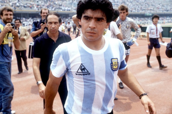
I think this one's pretty slick

but honestly? this guy right here is easily the greatest club of all time

#2707 ·
wiredfalcon2 said:I don't get why you're obsessing over these kinds of kits. I know you have a thing for design, or at least aesthetics. (You're a construction guy, right?)
This design is garbage. A two-year-old could come up with this. It's just a plain blue t-shirt. There’s zero artistry here. No identity, no nothing.
If you're really trying to lean into that old-school vibe, why not go with this:
Between the years 1909–1914, France wore a white shirt with blue stripes, white shorts, and red socks.
Ever since Adidas came around, their kits have always had some kind of variation so they aren't just a basic blue shirt;
http://www.classicfootballshirts.co....rance.html?p=1
http://www.glauy.com/ebay/poster/Michel-Platini.jpg
They've been doing stuff like this for like 30 years.
This is like a throwback to 1901 and cotton shirts. There are billions of people in the world and this doesn't look like anything unique, let alone something recognizable. Stick a Dutch crest on it and boom, it's a Dutch away kit. Put a local club logo on it and suddenly it's them. Put a Scottish one on and it's Scottish. Seriously, stick any random crap of a crest on a shirt like the one Platini is wearing in that top photo and everyone will call it French.
Like someone already pointed out, I am an architect, and personally, I’m not looking to pick fights with construction guys.🤣
When it comes to design, it's all subjective. This is a national team, and in my book, you shouldn't overthink it or try too hard—just keep it simple. Personally, I dig these retro kits because most of them, whether in photos or from a distance, look like they belong to an era when football was something different. They feel romantic and nostalgic to me. But then you actually hold one in your hands and see all those tiny details and the high-quality craftsmanship that modern football tech brings to the table.
Honestly, I think this is actually the most modern way to make kits right now: taking inspiration from vintage styles but giving them a contemporary edge.
If the French had gone with a plain blue Adidas kit last time, Nike would have probably pushed something totally different by now—lines, circles, whatever. You have to look at this through a different lens: this is essentially a rebranding of the French national team. Their prestige has plummeted so much over the last five years—to the point where they've actually struggled to sell tickets for home games—that they need this. It's symbolic. This is the "New France," looking like the old version from back when we were all united and strong, acting as one unit. We're going to move forward together and restore France to its former glory. aux armes citoyens, formez vos bataillons, marchons, marchons! 😁 The French are actually quite similar to Mexicans in many ways; that narrative would really land.
As for the next kit, expect blue and white stripes, or maybe solid blue with fine white pinstripes, or some combo with more red... For now, they had to create something that felt different yet still distinctly French.
#2708 ·
bluebison47 said:
The new Brazil kit
A green line? Someone’s clearly lost the plot. My screen is acting up right now, but is this thing supposed to play samba when you touch it? Or is it just a loading bar? I'm genuinely dying to know how long it took them to come up with this masterpiece...
edit: okay, so I'm reading that it's supposedly for "ventilation" and represents some tribal colors... which, honestly, isn't exactly rocket science. I don't get why they even bothered writing an explanation in the first place... it's painfully obvious ☕

#2709 ·
gentlebear47 said:He's an architect, and frankly, leave us construction guys out of your insults!☕
🤣 🤣 🤣
construction vs. aesthetics 🤣😂
Patrick Martin said:
I think this one's pretty slick
but honestly? this guy right here is easily the greatest club of all time
Honestly, they're great—way better than what Adidas is putting out right now👍
#2710 ·
mellowowl38 said:Like someone already pointed out, I am an architect, and personally, I’m not looking to pick fights with construction guys.🤣
When it comes to design, it's all subjective. This is a national team, and in my book, you shouldn't overthink it or try too hard—just keep it simple. Personally, I dig these retro kits because most of them, whether in photos or from a distance, look like they belong to an era when football was something different. They feel romantic and nostalgic to me. But then you actually hold one in your hands and see all those tiny details and the high-quality craftsmanship that modern football tech brings to the table.
Honestly, I think this is actually the most modern way to make kits right now: taking inspiration from vintage styles but giving them a contemporary edge.
If the French had gone with a plain blue Adidas kit last time, Nike would have probably pushed something totally different by now—lines, circles, whatever. You have to look at this through a different lens: this is essentially a rebranding of the French national team. Their prestige has plummeted so much over the last five years—to the point where they've actually struggled to sell tickets for home games—that they need this. It's symbolic. This is the "New France," looking like the old version from back when we were all united and strong, acting as one unit. We're going to move forward together and restore France to its former glory. aux armes citoyens, formez vos bataillons, marchons, marchons! 😁 The French are actually quite similar to Mexicans in many ways; that narrative would really land.
As for the next kit, expect blue and white stripes, or maybe solid blue with fine white pinstripes, or some combo with more red... For now, they had to create something that felt different yet still distinctly French.
I don't know what could be more iconic than the titles from the '84 European Championship and the '98 World Cup when they basically wore the same kit. It’s definitely not just some basic blue shirt.
Check out the first three Roma kits (just scroll down to the last three);
http://www.asromaultras.org/maglienuova_anni20.html
So, what exactly counts as a "retro" Roma kit? Is it because of the Giallorossi nickname, the first one, or the second? 😁 Look at the links for the other years; you'll see how the kit constantly shifts if you look at the long term (they even used white as a home kit a few times in the 70s). Colors of the shorts, socks, shades of hue—it changes constantly. There isn't really one single "anchor" for what defines a retro kit (you can see how the French had blue and white stripes for years right after they were founded). Take the original Brazil kit, if I remember right—it was white because those shirts were the cheapest available. What would we do then? Go back to white and ditch the legendary yellow? [whatever 😬]. Look, simplicity is usually tied to a specific era, but that's often not even the "original" kit, since designs changed plenty of times before and after. Even Roma changed back in the 30s, and the style seen under Kappa was just popular during their peak success in the 80s, but it wasn't always like that.
If you like it because it reminds you of the era when players were actual superstars, lived large, drove the best cars, and had hordes of fans worshipping them (the 60s, 70s, 80s), then fine. But that isn't "retro" in a design sense. It's not even interesting from a design standpoint. They say taste is subjective, and just because a two-year-old could have drawn this doesn't mean the kit is inherently bad, but this French kit is exactly what I said—unrecognizable, uninteresting, boring, and pointless. I don't like excessive flair on kits, not really, but that French kit from 1984 is beautiful because it isn't overdone. A plain blue shirt won't help rebrand France; great results on the pitch will. So, what, should the local team switch to red home kits just to rebrand themselves after their recent management mess?

#2711 ·
Patrick Martin said:
I think this one's pretty slick
but honestly? this guy right here is easily the greatest club of all time
Maradona's take --- Someone's cutting my coke! ☕
And this other one... damn, look at that cleavage 🙏

#2712 ·
Carol Lewis50 said:The Frenchies are switching things up next year after sticking with Adidas for 40 years. It’s a killer kit, though—that collar especially gives off those old-school tailored Umbro vibes, even if they're actually under the same corporate umbrella.

I always associate the French guys with their Adidas gear, but honestly, I’m just not feeling this dark shade of blue at all; if I'm being totally real, I actually thought the French national jersey looked way better. 😢

#2713 ·
Honestly, a French jersey without those horizontal stripes—you know, the one thick red one and the three thinner white ones—is just total garbage. ☕
#2714 ·
wiredfalcon2 said:I don't know what could be more iconic than the titles from the '84 European Championship and the '98 World Cup when they basically wore the same kit. It’s definitely not just some basic blue shirt.
Check out the first three Roma kits (just scroll down to the last three);
http://www.asromaultras.org/maglienuova_anni20.html
So, what exactly counts as a "retro" Roma kit? Is it because of the Giallorossi nickname, the first one, or the second? 😁 Look at the links for the other years; you'll see how the kit constantly shifts if you look at the long term (they even used white as a home kit a few times in the 70s). Colors of the shorts, socks, shades of hue—it changes constantly. There isn't really one single "anchor" for what defines a retro kit (you can see how the French had blue and white stripes for years right after they were founded). Take the original Brazil kit, if I remember right—it was white because those shirts were the cheapest available. What would we do then? Go back to white and ditch the legendary yellow? [whatever 😬]. Look, simplicity is usually tied to a specific era, but that's often not even the "original" kit, since designs changed plenty of times before and after. Even Roma changed back in the 30s, and the style seen under Kappa was just popular during their peak success in the 80s, but it wasn't always like that.
If you like it because it reminds you of the era when players were actual superstars, lived large, drove the best cars, and had hordes of fans worshipping them (the 60s, 70s, 80s), then fine. But that isn't "retro" in a design sense. It's not even interesting from a design standpoint. They say taste is subjective, and just because a two-year-old could have drawn this doesn't mean the kit is inherently bad, but this French kit is exactly what I said—unrecognizable, uninteresting, boring, and pointless. I don't like excessive flair on kits, not really, but that French kit from 1984 is beautiful because it isn't overdone. A plain blue shirt won't help rebrand France; great results on the pitch will. So, what, should the local team switch to red home kits just to rebrand themselves after their recent management mess?
Of course they wouldn't; they didn't change their primary colors either. I'm telling you, this was designed to break away from the old look. It'll likely be paired with white shorts and red socks, and they'll look pretty sharp on the field. Sometimes it's easier to add elements to a kit than to strip them away. Personally, I think it looks good. As for how much this screams "France":

It's all about preference. To me, this new Nike one beats all their Adidas kits from the last few years. Kits evolve; they picked this style for a reason. Man United had a similar vibe once—that one with the V-shape on the front—and it was killer. So, if they pair this with white shorts and red socks, and make the away kit all white with a tricolor sash running from the right shoulder to the left hip, I'll be more than happy.
#2715 ·
That kit is trash, but this one? This one's killer;

And we aren't just talking about some basic blue tee here.
Look, when I was talking about the red kits from the LA Galaxy, my point was that no fancy new jersey is going to fix the reputation of American soccer. Not even a kit change for the Galaxy is gonna do it. It’s all about results and people actually putting in the work—on both sides of the ball. In France, they're already starting to see that shift.

#2716 ·
Nike's kit looks better too. Honestly—I’m all about that simple, clean look. But yeah, I'm with Brenda Cook2 on this one. This jersey has zero connection to France. At least, not the France I know.
#2717 ·
You can see it a bit better here

Not sure why there's even a debate about some random French jersey? 🤷 Thuram mada totally wrecked them 👎 It looks clean and simple though, exactly how Umbro would've handled it (isn't Umbro owned by Nike anyway?)

Not sure why there's even a debate about some random French jersey? 🤷 Thuram mada totally wrecked them 👎 It looks clean and simple though, exactly how Umbro would've handled it (isn't Umbro owned by Nike anyway?)

#2718 ·
Brenda Cook2 said:You can see it a bit better here
Not sure why there's even a debate about some random French jersey? 🤷 Thuram mada totally wrecked them 👎 It looks clean and simple though, exactly how Umbro would've handled it (isn't Umbro owned by Nike anyway?)
Man, oh man... this is definitely something worth showing off at the bar tonight😁


🔗 Similar threads
- Does the "big club" hype actually ruin good players? in Fans · Jul 30, 2026
- Do team kits go too far these days? in Hobbies & Leisure · Jul 30, 2026
- The "big club" trap in Off-topic · Jul 30, 2026
- Does anyone else miss the era of "one-club" legends? in Fans · Jul 30, 2026
- Is the "Superclub" era actually killing the spirit of the game? in Fans · Jul 29, 2026