CheckEmoji Community · the emoji forum
🏠 Home 🆕 What's new ❓ Unanswered 🔥 Popular 📡 RSS Members 👥 0 online log in · register
Home › mellowowl38 › Posts

Posts by mellowowl38

285 posts shown.

Soccer Club Kits, Vol. 1 in Soccer ·
So, everyone clearly remembers those Udinese kits from last season—you know, the ones covered in those heavy black-and-white stripes. Well, it looks like Lotto decided to ditch that simple vibe entirely and cooked up something way, way different for the new season:

image
Soccer Club Kits, Vol. 1 in Soccer ·
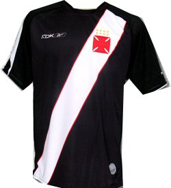
Jerry Evans57 said:In my eyes, Vasco’s kits have always been pretty terrible. They never change, even though there were much better designs back in the day, but I suppose consistency is their only rule.

image image

Personally, I think these jerseys are actually great. They probably would've hit a different level if Nike had handled them, but hey, considering their usual "design" sense, these might actually be the best Reebok kits they've ever put out. Both River and Boca have basically stuck to the same look forever—just based on how the colors are split. Not trying to be nitpicky here, but River always had that red stripe on white, and Boca always rocked the horizontal yellow on blue. They messed around with a lighter shade of blue for a few years, but thankfully they finally brought back the original version a couple of seasons ago.

image image

Aside from that, maybe it's because of this, but after Dinamo, my two absolute favorite clubs are Boca and Celtic. Their kits are legendary. I actually love that Celtic hasn't gone crazy changing their designs all the time; the ones they've had since last season are top-tier:

image
Soccer Club Kits, Vol. 1 in Soccer ·
urbanhawk17 said:I guess Kanoute actually stopped wearing the 888.com logo on his Sevilla jersey for a while. Apparently, it's a gambling site, and that just didn't sit right with his faith 🙂

I figured as much. Anyway, I was watching ESPN earlier—they're doing this tour around the States right now—and I just saw what I can only describe as the most hideous Nike kits for next season:

LA Galaxy

image
Soccer Club Kits, Vol. 1 in Soccer ·
casualpuma71 said:Just a little something you might find interesting 🙂

image

Those Austrian kits are predictably ugly. Even though Rapid Vienna is actually my favorite team over there, why on earth do the players have different sponsors on their jerseys?
Soccer Club Kits, Vol. 1 in Soccer ·
If you ask me, the biggest shift is the away kit—it used to be absolute trash, easily the worst in all of Europe, but now? It’s actually decent. Even the home kit looks killer; honestly, it turned out way better than I expected when I first caught a glimpse.

image

I’d go as far as saying we’ve scored the best kits out of all of Diadorin's clubs this season, hands down. My only beef with these is that bit on the back where it says LA Galaxy; it feels totally unnecessary. Plus, having the crest smack in the middle instead of on the left side is just weird. But compared to last year and a bunch of other jerseys from more established brands I've checked out this season, these are top-tier.

On another note, I’m really digging the new Varteksov home kit too. I realized it’s not that obnoxious blue-and-white combo anymore; it’s mostly blue with just a few red (or maybe orange?) stripes. It’s a nice little refresh.

image
Soccer Club Kits, Vol. 1 in Soccer ·
Thomas Johnson7 said:Having seen all three of the LA Galaxy's kits in person or on screen, I have to admit that the blue home jersey has suddenly become my clear favorite. The away kit isn't bad, though it feels a bit too flashy—it would probably be quite popular in Italy 😁. As for the European kit, it’s decent enough, but it feels a little off because those aren't really the club's true colors.

For me, the European kit is still the absolute king, but honestly, both the away and home versions are several levels above anything they've released before. And hey, can we talk about how great it is that we finally have names on the jerseys for domestic league games? It felt a little ridiculous seeing it with Slepički, but whatever, I guess we can suffer through one weird one.
Soccer Club Kits, Vol. 1 in Soccer ·
lonetrucker29 said:Getafe: absolute nonsense!!!! but hey, at least they tried being innovative for once!!!

Why did Bayern Munich change their kit??? The old ones were way better!!!!

Honestly, why do clubs even bother switching up their kits anyway? Usually, sales tank, so they just force a new design on us to try and squeeze more cash out of fans.
Soccer Club Kits, Vol. 1 in Soccer ·
EDIT
Soccer Club Kits, Vol. 1 in Soccer ·
Portland Timbers

Houston Dynamo

San Francisco

Orlando City SC

San Diego

New York City

Honestly, there’s just way too many blue and white kits floating around. Look, I am strictly against messing with home kits—that’s sacred ground—but when it comes to away jerseys? Why not branch out? Just look at LA Galaxy or, judging by what we're seeing here, even Los Angeles Locomotive. Aside from Istria and maybe Cincinnati FC, pretty much every single club has a blue or white kit in their rotation. I seriously don't see why one American team couldn't rock something like this:
image

One Milwaukee could go with something like this:
image

or Portland could try these:
image
Soccer Club Kits, Vol. 1 in Soccer ·
So, according to ESPN, here’s what our league's kits are looking like for next season:

Cincinnati FC

America

LA Galaxy

Split SC

Inter Miami CF

Istria

Milwaukee

Los Angeles Locomotive

Columbus Crew

Portland
Soccer Club Kits, Vol. 1 in Soccer ·
Honestly, all the kits so far have been pretty decent, but man, there’s this chronic lack of guts and creativity when it comes to the away kits. Specifically looking at Milwaukee SC and Los Angeles Locomotive—their home and away looks are basically identical, which is kind of a snooze fest. I'm digging the San Francisco one, and the Columbus Crew away kit is alright, though they've never actually worn it in a match. I still remember one season where Columbus had this yellow and black striped away kit that looked absolutely killer, but just like now, they never actually stepped onto the pitch in it once. I actually like the Pulin away kit too, but it'd be a shame if they only end up wearing it for a single game all season. As for Milwaukee SC, like I said, they're uninspired... does anyone even know who their sponsor is?

Btw, @Betty Turner8, you planning on posting the rest of the league's kits too?
Soccer Club Kits, Vol. 1 in Soccer ·
Michelle Palmer6 said:Honestly, what’s wrong with Joma? Even Deportivo La Coruña has been using them for ages, and I don't see anyone complaining about the kits!

Honestly, Adidas has some pretty decent designs too, which just proves my theory: the massive corporations always end up making the ugliest, most boring jerseys imaginable.
Soccer Club Kits, Vol. 1 in Soccer ·
Maria Bennett4 said:honestly, every club should be doing this. Just drop three different designs and let the fans decide which one actually looks good. I mean, there's no way a single Getafe CF supporter would ever choose that absolute garbage they put out

Since it's Joma, I doubt they'll actually give us much of a selection, to be honest. 😁
But looking at it realistically—even from my perspective as a marketing and finance expert for some massive money-printing machine, aka a top-tier European football giant—it’s actually a genius move. By offering three options, you're basically guaranteeing success because you're letting the fans vote for the one that’s most likely to sell. It's foolproof.
Soccer Club Kits, Vol. 1 in Soccer ·
silverjackal said:Oh yeah, there's plenty...

Honestly, it’s one thing, but man, whenever I see someone walking around in a Red Star jersey, I swear I lose it. I get so heated, I just want to rip it right off them. Seriously.😁😁

Then why don't you? He totally earned it.
Soccer Club Kits, Vol. 1 in Soccer ·
blueridge32 said:I just saw a bunch of people rocking Lazi's jersey over in Cleveland... What's Mike up to now? Honestly, I think Bokšić had a pretty solid run at Lazi too.

Why does "fakat" even have a specific meaning? Seriously, what's the deal with that?

Mike actually had a much better 😁
Soccer Club Kits, Vol. 1 in Soccer ·
swiftfalcon17 said:Hey, does anyone happen to know where I could pick up an authentic Lazi jersey in Washington, D.C.?

Washington, D.C. is a total Democratic stronghold, you won't find any fascist jerseys here... ☕

Just kidding, but honestly, good luck finding one since there isn't even a Puma store around here. Maybe try checking out that old sports shop—I think it's called something else—on the north side of the street that connects the park area to The Ritz-Carlton (I can't remember the street name for the life of me).
Soccer Club Kits, Vol. 1 in Soccer ·
Amy Hughes2 said:Solid kits. Honestly, I can't even remember us having ones this good... at least not since I started following Dinamo Chicago seriously.
Design-wise, the dark navy one is the winner, though the standard blue is probably more "us" color-wise. Also, the gold looks way better than the orange or silver options they've thrown at us before.

I’ve always wondered why we insist on those near-black navy kits for Champions League matches... 🤷 Don't get me wrong, they look sharp, maybe even sharper than our home kit, but Dinamo Chicago isn't a dark navy team to me. I'd much rather see them rocking that classic, true blue even when we're playing in Europe...

Because they're freaking 😁
Look, I have no clue why we do it. Schalke 04 does it, Copenhagen does it, plenty of other clubs go this route too. Personally? I think that European kit is killer. The color is just so bold, and honestly, both the old one and this new version look incredible. It just feels sophisticated, you know? Like it was made specifically for the big stage in Europe.
Soccer Club Kits, Vol. 1 in Soccer ·
Anyway...

The kit looks killer, I'll give them that. But honestly, they could've put in a little more effort and maybe coordinated the State Farm logo so it isn't just hanging out there looking as navy as the shoulders. Whatever.
Soccer Club Kits, Vol. 1 in Soccer ·
Thomas Johnson7 said:Personally, I’m leaning toward the away gold kit. It feels like a genuine breath of fresh air compared to the silver and white options—not to mention those orange ones, which were a bit much.
The European and domestic kits are both quite solid, though I have a slight preference for the European version.
Looking ahead to 2011, it would be a nice touch if they released something reminiscent of the 1911 style worn by the old local club legends.

As for the Copenhagen set, it feels a bit lazy. That pink jersey is an absolute disaster, and honestly, there's barely any distinction between the home league kit and the one meant for European competition.

What do you mean you can't see a difference? The home kit has red accents on the shoulders while the European version uses more blue, plus the away kit for Europe is black whereas the home one is navy.😂
Soccer Club Kits, Vol. 1 in Soccer ·
This is hands down the most unhinged thing I've ever seen involving football kits. I don't think I've ever encountered anything this extra—Copenhagen went absolutely wild and dropped five different kits for the 2009/2010 season!

image

Alright, let's break down this madness. Moving from left to right: the first one is the home kit for the domestic league and cup, the second is the away kit for European competition, the third is the home kit for Europe, the fourth is the keeper jersey, the fifth is the third kit, and the sixth is the away kit for the domestic league and cup. This is just straight-up pathological...