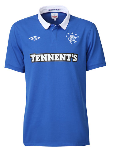
Peter Reed70 said:Give me a break, guys! It’s just a plain blue shirt with a white collar and the Rangers FC crest... what is there even to get hyped about?
I’d bet money that the very first comment on this jersey was negative, just to set the stage for five more haters to jump in. Total trolls!
Look, putting everything else aside, if I'm going to be impressed by this kit, all I need to see is that Herthe logo up top. 😁
I mean, pure simplicity at its finest. Honestly, it’s the best kit for the upcoming season I've seen so far.

Take their rivals, for instance. For years, Celtic always had the better kits, but then look at this:

It’s like our own situation here in the States—you get stuck with a specific template and zero room to play around because you have to stick to certain colors or patterns, like some patriotic stripes or whatever. And yet, they still managed to mess it up. Man, if they had just tried adding some Celtic knotwork, or even better, a subtle tartan pattern like they did on the away shorts—something you could only really spot up close, kind of like a hidden texture. Instead, they slapped on this "discount carpet store" design inside the green stripes. I don't know what possessed Nike all of a sudden, but this... look, it isn't an ugly kit, not by a long shot. But sitting here late at night, I've actually come up with two ideas of my own. If they gave me one day, I’m pretty sure I could design something way better. They’ve got eight whole months to work on a kit and this is what they come up with? It’s gotta be better than this.